CSS Battle: Target 151 - Pawn

In this article, I am sharing the solution for the target Pawn from the Battle 25 flex.
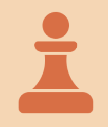
Target
We need to create the following container by using CSS Properties only:
Solution
Create the circle
Create a rectangle shape and apply the border-radius
Create another rectangle for the center structure and apply the pseudo-classes and border-radius
Similar to point 2 shapes with different heights and border-radius
Check the solution from the Youtube video
HTML
Here I am adding four div tags with classes a, b, c and d
<div class="a"></div>
<div class="b"></div>
<div class="c"></div>
<div class="d"></div>
CSS
Adding background color, for a class with a width and height of 50px, border-radius 50% and top and left with 55px and 175px respectively
 * {
    background: #F5D6B4;
   }
  .a,.b,.c,.d {
    background: #D86F45;
    position: fixed;
  }
  .a {
    width: 50px;
    height: 50px;
    border-radius: 50%;
    top: 55px;
    left: 175px;
  }
In class b, adding width, height, top, left and border-radius
.b {
    width: 80px;
    height: 20px;
    border-radius:30px 30px 70px 70px;
    top: 110px;
    left: 160px;
    }
for class c, add pseudo-class before and after
.c::before, .c::after {
    content: "";
    width: 30px;
    height: 65px;
    top: 0px;
    left: -7px;
    border-radius: 0px 0px 100% 0px;
    position: absolute;
    background: #F5D6B4;
   }
  .c::after {
   border-radius: 0px 0px 0px 100%;
   left: 63px;
   }
In class d, adding width, height, top, left and border-radius
.d {
    width: 140px;
    height: 40px;
    border-radius: 20px 20px 10px 10px;
    top: 205px;
    left: 130px;
  }
Wrap up
There are many ways to solve this. You can share your approach in the comments. If you like this then don't forget to ❤️ it. And I'll see you at the next target. See you soon.


